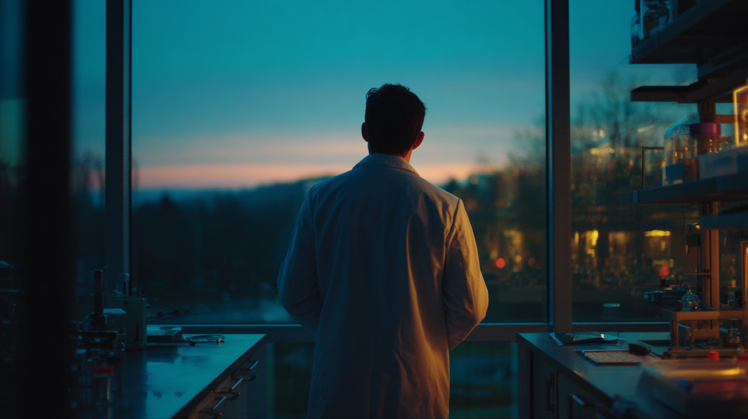
I've looked at a lot of biotech websites over the past year. Not as a critic — as someone trying to understand how companies in this space communicate what they're actually doing.
The pattern that keeps surprising me: the science is often genuinely extraordinary, and the website makes it look like a 2014 WordPress installation.
That gap matters more than most founders think. A 2023 Stanford study found that 75% of credibility judgements are made on design alone — and that judgement happens in about 50 milliseconds. Before anyone reads your pipeline page, before they find your publications, before they see who's on your scientific advisory board, they've already formed an opinion.
Here are seven signs the website is doing damage.
1. Your homepage leads with mechanism, not outcome
"Our proprietary CRISPR-adjacent platform enables multiplexed target engagement across heterogeneous cell populations."
I've read sentences like this on the homepages of companies working on genuinely important things. The science is real. The writing makes it invisible.
Investors fund outcomes. Partners want to know what changes. If your above-the-fold message describes how your platform works before what it changes for real people, you're asking visitors to care before you've given them a reason to.
One sentence about the human impact — then the mechanism. Not the other way around.
2. Your credibility signals are buried three scrolls down
Clinical milestones. Regulatory approvals. Publications in Nature. Partnerships with major hospital networks.
If these aren't visible in the first scroll, they might as well not be on the site. Trust is built in the first ten seconds or it isn't built at all. An investor who has to hunt for your EFSA approval is an investor who wonders if you're hiding something — even if that's not remotely true.
3. Your visual language doesn't match your scientific ambition
Stock photography of DNA helices. A blue gradient. A sans-serif font that ships with every Mac.
I don't say this to be unkind — most biotech founders are focused on the science, and the website gets assembled quickly between funding rounds. But visual coherence is a proxy for organisational coherence. If the presentation looks like nobody cared, the assumption is that nobody does.
4. You have no clear path for different visitor types
An investor needs different information than a potential hire. A research collaborator wants different things than a patient advocacy organisation. If your navigation doesn't guide each of them somewhere specific — a dedicated investor page, a pipeline overview structured for non-scientists, a team page that reads like a story rather than a roster — you're losing all of them.
5. Your technology page requires a PhD to follow
This is the most common problem I see, and I understand why it exists. The people writing the content are the scientists who built the technology. They know it completely, so they write for people who know it almost as well.
Legibility isn't dumbing down. It's respecting the time of someone who doesn't have your background but might fund your next round, join your board, or partner with you on a trial. If your lead scientist is the only person who fully understands your technology page, it's a liability in every meeting where that scientist isn't in the room.
6. The site still reflects where you were 18 months ago
Last funding round announced. Previous pipeline stage listed. Team photo that no longer includes three of the people in it.
In a sector where things move fast, a static website reads as a company that's standing still — even when the opposite is true. It also signals to potential partners that digital communication isn't a priority, which creates a specific kind of doubt about execution capacity.
7. There's no human face on the science
This is the one that gets underestimated most often.
Biotech isn't just built on data. It's built on trust in the people doing the work — their judgment, their commitment, their reasons for choosing this particular problem. A founding team section with real photos, real backgrounds, and a sentence about why this work matters personally converts sceptical visitors into curious ones faster than any pipeline diagram.
People back people. The website should make that possible.
If three or more of these apply, it's worth asking whether your digital presence is working with your fundraising and partnership conversations — or running slightly against them.


